


Fashion color palettes: unlock timeless style in 2026
TL;DR:
- Color influences up to 90% of first impressions in fashion. Personal color palettes, like seasonal analysis, help create cohesive and flattering wardrobes. Modern research shows breaking traditional color rules can lead to more stylish and expressive outfits.
Color shapes everything you wear, often before you have a chance to think. Up to 90% of snap judgments about a look come down to color alone, which means your palette is doing most of the heavy lifting before a single word is spoken. This guide breaks down the psychology, science, and practical strategy behind color palettes in fashion. Whether you want to refine your everyday outfits or build a wardrobe that works season after season, understanding color is the single most powerful move you can make.
Table of Contents
- Why color palettes define first impressions and style impact
- How seasonal color analysis personalizes your wardrobe
- The science and art behind color harmony in outfit building
- Coordination strategies for a timeless, versatile wardrobe
- What most stylists won’t tell you about fashion color palettes
- Explore more on building your color-savvy wardrobe
- Frequently asked questions
Key Takeaways
| Point | Details |
|---|---|
| Color drives first impressions | Up to 90% of judgments on style are influenced by color palette choices. |
| Seasonal palettes maximize versatility | Choosing neutrals from your seasonal palette ensures cohesive and timeless outfits. |
| Modern tools update tradition | Machine learning and empirical data now guide color harmony better than old rules alone. |
| Use the 60-30-10 rule | Balancing dominant, secondary, and accent colors provides effortless wardrobe coordination. |
Why color palettes define first impressions and style impact
When someone glances at your outfit, their brain processes color before shape, fabric, or fit. That is not an opinion. It is biology. Color psychology in fashion shows that certain hues trigger physiological responses: red increases heart rate and signals energy, while deep navy or charcoal quietly communicate authority and composure. These reactions happen in milliseconds, well before conscious thought kicks in.
Understanding fashion psychology helps you see that color is not decoration. It is communication. When you wear a color that aligns with the impression you want to make, your confidence increases naturally. When your palette clashes with your personal coloring or your environment, something feels off even if no one can name exactly why.
“Up to 90% of initial judgments on fashion are swayed by color.” That number should change how seriously you take your palette decisions.
Here is why color choices matter beyond aesthetics:
- Instant judgments: People form opinions about your energy, status, and approachability based on color before anything else.
- Emotional resonance: Wearing colors that suit your natural coloring makes you appear healthier, more vibrant, and more put-together without extra effort.
- Wardrobe appeal: A cohesive palette means pieces naturally mix and match, reducing decision fatigue and wasted spending.
Tracking color trends in apparel can be useful context, but reacting to every trend without a personal framework leads to a wardrobe full of pieces that do not connect. The goal is to build something that reflects who you are while working across occasions. That starts with understanding which colors actually work for you, not just which ones are popular right now.
After understanding the value of color, let’s see how personal palettes are determined.
How seasonal color analysis personalizes your wardrobe
Seasonal color analysis is one of the most practical tools in personal style. The system places each person into one of four main types: Spring, Summer, Autumn, or Winter. Each type reflects a combination of skin undertone, natural hair color, and eye color. Refinements within each season create 12 sub-seasons based on undertone, value (light to dark), and chroma (muted to vivid), making the framework surprisingly precise.
Here is a quick comparison of what each season looks like in practice:
| Season | Signature neutrals | Best accent colors |
|---|---|---|
| Spring | Warm ivory, camel, light brown | Coral, peach, warm gold |
| Summer | Soft white, taupe, light gray | Rose, lavender, powder blue |
| Autumn | Rust, chocolate, olive | Burnt orange, mustard, forest green |
| Winter | Pure white, black, charcoal | Cobalt, emerald, crimson |
To find your season, work through these steps:
- Examine your undertone. Hold warm (gold) and cool (silver) fabric near your face in natural light. Whichever makes your skin look brighter reveals your undertone.
- Assess your value and chroma. Is your overall coloring light or deep? Are your features soft and muted or high-contrast and vivid?
- Match sample palettes. Hold a range of swatches from your suspected season against your face and observe which set makes your features look clearer and more alive.
Pro Tip: Once you know your season, build your core wardrobe around season-specific neutrals first. These are the pieces you reach for every day. Camel works beautifully for Autumn types in a way that trends rarely replicate, and it pairs with almost everything in that palette.
Why does this matter more than following trends? Because seasonality in clothing choices tied to your personal palette outlast any runway moment. A trend color may look flat or harsh against your skin. Your personal neutrals, by contrast, always work. Understanding seasonal fashion basics and embracing seasonal trends intelligently means knowing which trend colors happen to fall within your palette and skipping the rest without hesitation.
With a personalized palette in mind, let’s turn to how palette harmony affects outfit coordination.
The science and art behind color harmony in outfit building
Most of us learned basic color rules somewhere: complementary colors sit opposite on the wheel, analogous colors sit side by side, and monochromatic looks use one color in varying tones. These rules have value, but color harmony in clothing research using psychophysical experiments and machine learning (ML) models reveals that real-world preferences often break traditional rules, especially across different style communities and cultures.

| Traditional rule | What ML research suggests |
|---|---|
| Complementary colors always pop | High contrast can feel jarring in casual wear |
| Analogous palettes feel safe | Often preferred, but can appear flat without texture contrast |
| Triadic combos are bold | Works well in streetwear; risky in minimalist contexts |
| Monochromatic is always elegant | Highly dependent on fabric weight and finish |
Here are the four harmony formulas worth knowing:
- Analogous: Two to three neighboring hues (e.g., olive, tan, rust) for a relaxed, earthy feel.
- Complementary: Colors opposite each other on the wheel for a high-impact, intentional contrast.
- Monochromatic: One color family in different shades or textures for a clean, modern look.
- Triadic: Three colors equally spaced on the wheel for a bold, editorial effect.
A recent color harmony study confirms that ML-guided combinations often outperform traditional theory in predicting what people actually find pleasing in real clothing contexts. This matters for how you shop and plan outfits.
Pro Tip: Before buying a new piece, use a free color palette tool online to test it against what you already own. This simple step prevents the “wardrobe orphan” problem where a great piece has nothing to pair with. It also reduces the impact on shoppers who buy impulsively and end up with a closet full of things that do not connect.
Sustainability is another reason harmony matters. Pieces you can actually style multiple ways get worn more. Explore sustainable fashion insights to see how a thoughtful palette reduces waste over time.
Let’s connect harmony principles to practical decisions when shopping for essentials or building versatile looks.
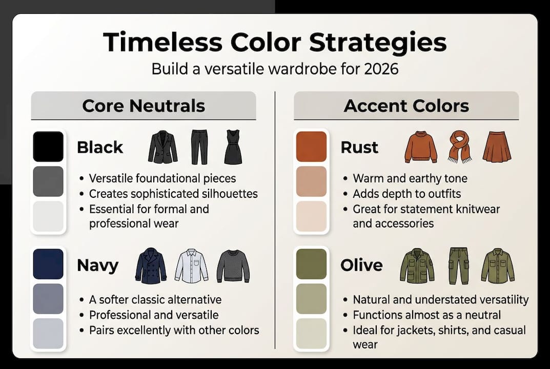
Coordination strategies for a timeless, versatile wardrobe
The 60-30-10 rule is the clearest framework for building balanced outfits. According to outfit coordination guides, 60% of your look should be a dominant neutral (think black trousers or a white tee), 30% should be a secondary color (a medium-toned layer or trouser), and 10% should be an accent (a belt, cap, or statement piece in a bolder hue). This creates visual balance without effort.
“Neutrals are not boring. They are the architecture. Everything else is furniture.”
Five practical ways to apply palette discipline every day:
- Limit accent colors to one or two across your entire wardrobe so everything connects naturally.
- Invest in double-duty neutrals like navy, camel, and off-white that work as either the 60% or 30% depending on the outfit.
- Test color in context, meaning consider where you are wearing something. Office lighting and outdoor light change how colors read.
- Phase out wardrobe orphans. If a piece has nothing to pair with after three attempts, it is not serving your palette.
- Account for cultural and mood factors. White signals freshness in some contexts and formality in others. Knowing your environment gives you confidence.
Here is how to coordinate a week of outfits using one palette:
- Choose three neutrals as your base (e.g., black, cream, olive).
- Select one accent color to rotate through (e.g., rust).
- Build each daily outfit using the 60-30-10 structure from those four colors.
- Swap textures and silhouettes, not colors, to keep things feeling fresh.
- On day seven, introduce one seasonal accent to test expansion without losing cohesion.
Neutrals are best-sellers for a reason. Colorful pieces carry higher demand uncertainty for brands and buyers alike. Neutrals remove that risk entirely. Understanding seasonal apparel importance helps you decide which neutrals to prioritize so your wardrobe stays cohesive through every season.
Now that you have mastered practical strategies, let’s rethink some common beliefs about color palettes.
What most stylists won’t tell you about fashion color palettes
Here is the uncomfortable truth: most color advice is built on rules that were never tested on actual clothing. The traditional harmony rules were derived from paint and light experiments, not fabric, texture, and movement. Modern ML research confirms what stylish people have always known intuitively: some of the most compelling outfits break every rule on the wheel.
Social media has accelerated this shift. What looks harmonious on a color wheel can look flat in a photo or on a body. What looks odd in theory can feel electric in person. The people who dress best are not necessarily those who studied color theory. They test combinations, get honest feedback, and iterate.
The real superpower is courage paired with a feedback loop. Try the combo. Take a photo. Ask someone you trust. Use a digital tool. Repeat. Your palette should evolve as your life does. Following social media’s role in trend cycles does not mean chasing every new color drop. It means staying informed so you can pick the moments when a trend actually fits your personal system.
Pro Tip: Revisit your seasonal color analysis every few years. Natural changes in hair, skin tone, and even lifestyle shift which palette feels most alive on you. Confidence is not static, and neither is your wardrobe.
Explore more on building your color-savvy wardrobe
If this guide sparked something, you are already thinking about your wardrobe differently than most people do. Color is not a cosmetic detail. It is the foundation of how your style communicates.
At Smoked Times, we build essentials designed to anchor exactly this kind of palette-first thinking. Heavyweight tees, clean hoodies, and well-cut basics in neutrals that actually last. If you want to go further with how color and season affect your clothing choices, start with our in-depth look at more on seasonality and color. Your best wardrobe is not the most colorful one. It is the most intentional one.
Frequently asked questions
How do I find my most flattering fashion color palette?
Start by identifying your skin undertone, value, and chroma. Seasonal color analysis organizes people into 12 sub-seasons, matching each with the most flattering and versatile palette for their natural coloring.
What is the 60-30-10 rule in outfit coordination?
The 60-30-10 rule means 60% of your outfit is a dominant neutral, 30% is a secondary color, and 10% is an accent, creating balance and style harmony without overthinking.
Why are neutrals important in a timeless wardrobe?
Neutrals like black, navy, off-white, and camel coordinate effortlessly across outfits. As timeless versatility research shows, they are consistent best-sellers precisely because they remove the guesswork from getting dressed.
Can color palette preferences change with trends?
Trends influence what colors feel current, but your personal palette remains the most reliable base. Prioritizing personal palette neutrals over trend colors ensures versatility that outlasts any season.
How does culture impact the meaning of fashion colors?
Cultural and environmental contexts shift how colors are perceived, meaning a hue that reads as elegant in one setting may carry different associations elsewhere. Color perception is always contextual, so understanding your environment is part of dressing with confidence.
Recommended
- Seasonal Apparel Trends 2026: Minimalist Comfort – Smoked Times
- 7 Top Fashion Trends 2026 to Upgrade Your Casual Style – Smoked Times
- Master the role of winter wear for style and warmth in 2026 – Smoked Times
- Color Trends in Apparel – Impact on Streetwear Style – Smoked Times
- Shoulder bag styles guide: curated picks for effortless luxury